

Overview
Problem
Viki is a streaming service specializing in Asian entertainment. However, the majority of Viki’s users have unverified emails, preventing us from effectively communicating with them. Whether it was sharing updates to Terms of Use and Privacy Policy or sending personalized marketing messages to keep them engaged, we were limited in our ability to connect with our users meaningfully.
My Role
Zing Yang - UX Designer
Presca L. - UX Designer
Linhsien W. - UX Copywriter
Evey L. - Product Manager
Aloysius L. - Data Analyst
Methods
Wireframing
A/B Testing
Tools
Figma
Miro
Timeline
Jan - Sep 2024
PROJECT SCOPE
Viki’s user base consists of two groups: new sign-ups and existing users. To stop the growing number of unverified emails, we decided to start with new sign-ups. Since most new users were signing up through our Mobile Apps (as opposed to Web or Connected TV), we chose to focus our efforts there. As such, the project will primarily target new sign-ups on Mobile Apps first.
GOALS
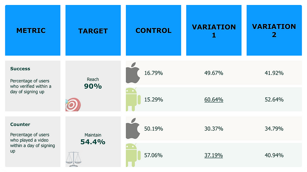
To evaluate the success of the solution, the following metrics were established:
🎯 Success metric: Increase the percentage of new sign-ups on Mobile Apps with verified emails within a day from 12% to 90%.
⚖️ Counter metric: Maintain the percentage of new sign-ups on Mobile Apps playing a video within a day at 54.4%.
These metrics ensure that while email verification rates improve, user engagement does not decline.
HYPOTHESES
We started by asking ourselves, “What is stopping our users from verifying their emails?” After reviewing the Mobile App sign-up flow, the following hypotheses were developed:
-
Lack of Visibility: Users might not even realize they need to verify their email because the task isn’t highlighted enough.
-
Lack of Motivation: Why bother verifying when you can start watching content right away?
-
Typos: Simple human error—a mistyped email address—could be blocking users from ever receiving the verification email.
IDEATION
Competitive Analysis
We analyzed the sign-up and email verification flows of competitors like Netflix, Disney+, and Amazon Prime, as well as non-streaming platforms.
The idea was to identify common patterns to guide our solution, ensuring that it felt familiar and intuitive to users. Here’s what stood out:
-
Sign-up and verification were often coupled into one seamless process.
-
Benefits of verification were clearly communicated at key touch points.
-
Instructions were easy to follow, and redirections worked smoothly.
Stakeholders Consultation
Next, we brought together representatives from Engineering, Legal, Customer Experience, and Marketing for a brainstorming session. This collaborative approach uncovered some important considerations:
-
The Engineering team flagged that accounts could be created even if the email contained typos, as long as it followed the standard email format (e.g., includes “@” and “.”).
-
The Customer Experience team highlighted the need for a mechanism to allow users with incorrect emails to recreate accounts to prevent an influx of support tickets.
-
Everyone aligned that content access is the main motivator for users. Limiting access until verification could encourage them to complete the process.
User Experience Considerations
While the business needs were clear, we wanted to maintain a user-centric approach. Why should they care about verifying their email? Here’s how we approached it:
-
Make it seamless: Combining the sign-up and verification steps would reduce cognitive effort.
-
Show the benefits: Educating users about why verification matters (e.g., account security, uninterrupted access) would help build motivation.
-
Stay user-friendly: We needed to let users achieve their primary goal—playing a video—even if verification was part of the process.
SOLUTIONS
Solution Overview
To integrate email verification seamlessly into the sign-up process:
-
A helper text under the email input field will inform users: “You’ll need to verify this email.” This set expectations early and discouraged users from using temporary email addresses.
-
A verification email will outline the benefits of verifying their account.

Two variations of the solution were designed and tested against the existing flow (Control):
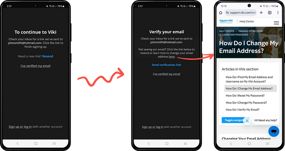
Variation 1
After entering their email and password, users encountered a mandatory verification block. They couldn’t explore the app until their email was verified. Features of this block include:

Variation 2
This version introduced a “Verify later” option. Users could explore the app but couldn’t watch videos until their email was verified. If they tried to play a video, they’d see a block prompting verification. Once verified, they’d be redirected to the video they wanted to watch—a seamless experience.


A/B TEST RESULTS
After weeks of testing on Android and iOS, here’s what we found:
-
Variation 1 outperformed Variation 2 and the Control, achieving a significant increase in verification rates.
-
However, the results fell short of the success and counter metrics.
After discussing the findings with the executive team, we decided to move forward with Variation 1 as the standard for Mobile App new sign-ups.
NEXT STEPS
With Mobile App new sign-ups addressed, we turned our attention to other user segments:
Mobile App Existing Users
Technical constraints meant we couldn’t differentiate new sign-ups from existing users. To adapt, we:
-
Adjusted the UX copy to be generic enough to apply to both groups.
-
Added a link directing users who lost access to their email to a help center article for self-service or support.
This solution is set to undergo A/B testing to ensure it resonates with existing users.
TAKEAWAYS
Looking back, while I wasn’t sure if the solution for new sign-ups could apply to existing users, I could have validated the technical feasibility of distinguishing both groups earlier. This would have allowed the team to experiment with both groups simultaneously, saving time and effort.
Every step of this process has been a learning opportunity and I’m excited to see how the A/B test for existing users unfolds.
Check Out My Other Works

